Our brand book
K2 X Border exists to provide clarity and confidence in global immigration.
We support businesses and individuals in navigating the complexities of international movement. Our team brings deep expertise and regional insight to ensure each case is managed with precision, consistency and care. We understand the risks, the timelines, and the pressures. More importantly, we know how to remove them.
Our work is global, but always grounded in personal service. Whether a business is relocating hundreds or an individual is managing a single, life-changing move, we bring structure, responsiveness and accountability to the process. Our immigration services are specialist by design and human in delivery.


Contents
Version 1

1.0 Brand assets, tools & rules
The following tools and guidelines exist to help you represent K2 X Border with clarity and consistency. Our brand is part of a wider group, but has its own voice, identity and visual system.
Whether you are creating internal documents, client materials or digital content, these assets ensure K2 X Border always looks and sounds like itself. If in doubt, keep it clear, confident and focused.

1.1 Logo
The story and use of our logo.
The K2 X Border logo is a key part of how we show up. It should always appear clear, legible and uncluttered. Use the full logo wherever possible and choose the version that provides the best contrast with the background.
Do not stretch, recolour or modify the logo in any way. If space is limited, use the approved icon version. Always check the artwork is up to date before use.
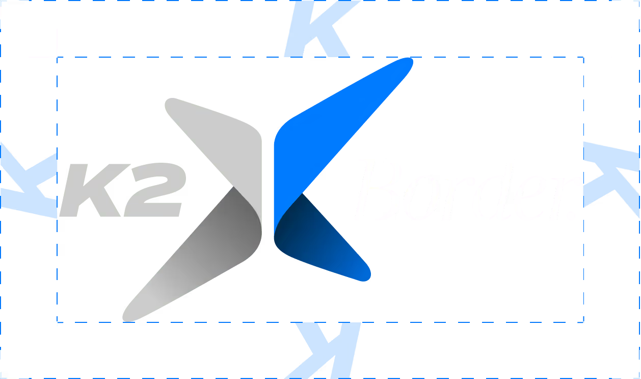
Clearspace.
The clear space is based on the counter of the K in the logo, as shown in the image. No other objects are allowed inside this area.
All backgrounds can be used behind the logo. However, when placing on top of images it should be positioned on calmer, less distracting areas.
Light & dark.
Depending upon the density of the background colour an alternative colour version is also provided.

1.2 Typography
Our typography has been carefully chosen to reflect clarity, precision, and versatility.
The fonts we use provide a clear and accessible reading experience, ensuring our messages are concise, professional, and easy to understand across all platforms and materials.
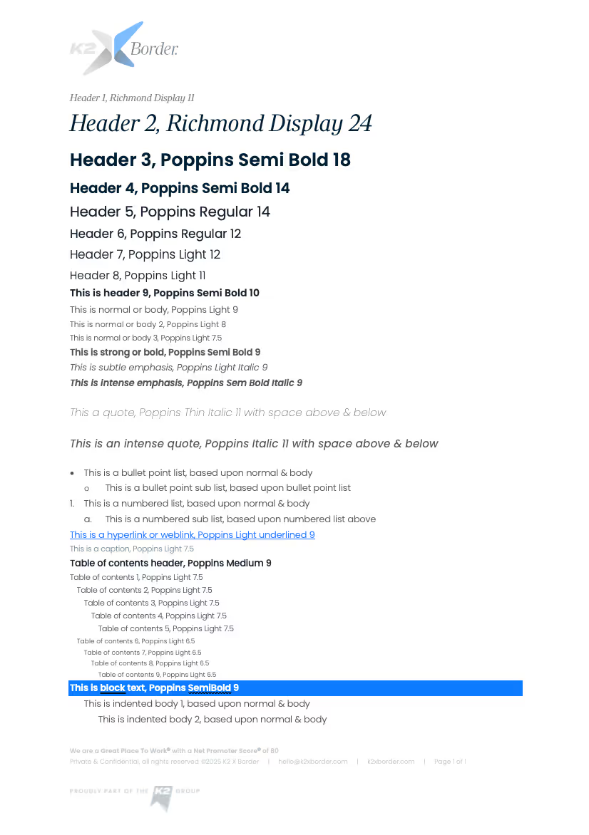
Primary typeface
Our primary font is Richmond Display. It’s confident, clean and designed for clarity. Use it for headings, short statements and areas where we want to make an immediate impact.
It should be used in sentence case, with plenty of space around the text. Avoid using all caps. Keep it sharp, legible and minimal. When used well, Richmond Display brings structure and focus to our communications.
Secondary typeface
Poppins is our go to font. It can be used for headings and body copy alike. It excels in applications that aim at a premium feeling, like invitations and letters. It is used in a variety of weight formats to add emphasis where necessary. Template documents are provided to assist in the understanding of usage.
When considering message heirarchy reduce the font by size by 25% from title to subtitle to body copy to notes and so on.
Where a document is being sent and cannot be controlled, for example in an email, Arial should be used.

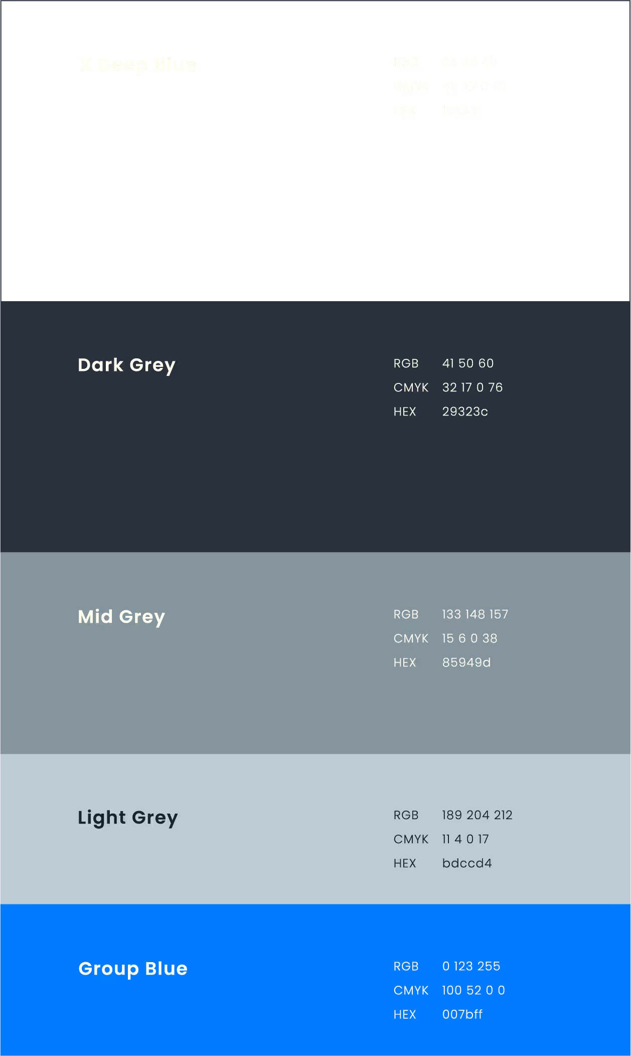
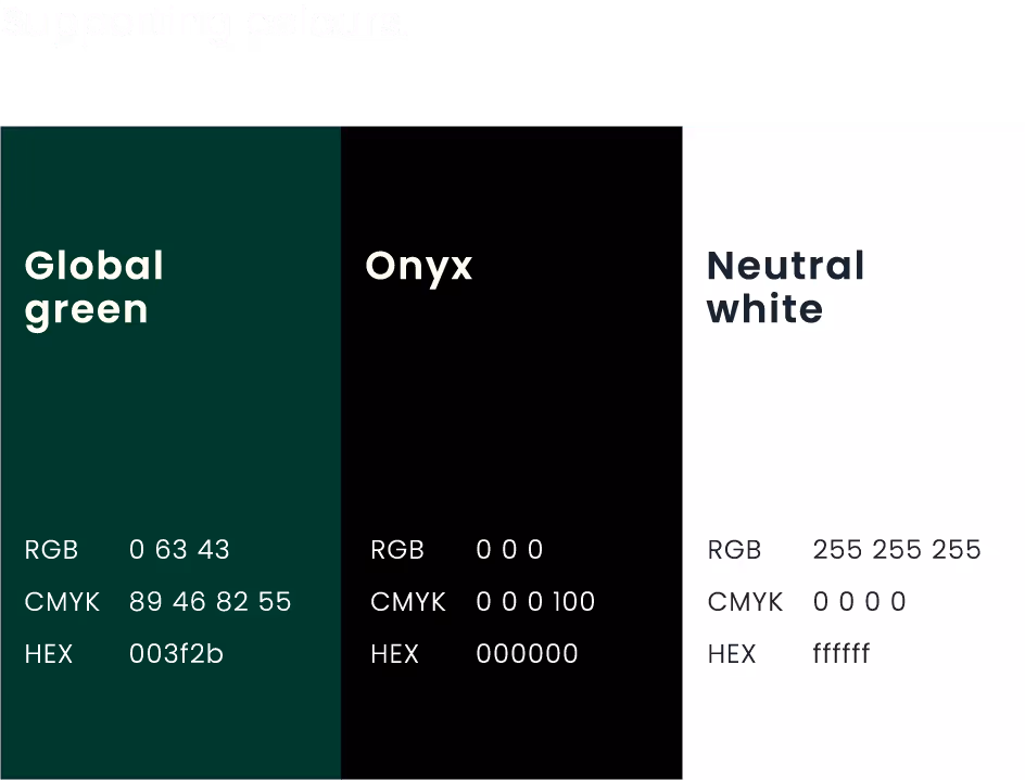
1.3 Colours
We have a distinctive colour palette comprised of X Deep Ocean, Group Blue, Dar Grey, Mid Grey, Light Grey, Group Blue & Global Green.
Although our approach to colour is simple, it does mean we need to use it in a single-minded way to ensure brand impact and recognition. This style guide has been created to show the right balance of colour that should be present in our core brand communications.
1.4 Icons
We do not use icons as part of the K2 X Border visual identity. This is a deliberate choice that reflects our focus on human-centred communication.
Icons can feel mechanical or overly process-led. Our approach is different. We prioritise clarity, direct language and thoughtful design to communicate in a way that feels personal and considered. Rather than relying on symbols, we use typography, imagery and layout to guide our audience through information with purpose and care.
1.5 Imagery
Imagery is a key part of how we express the K2 X Border brand. Every image is chosen to reflect our values of clarity, care and global perspective, while inviting trust and reassurance.
We lead with aerial imagery to convey scale, movement and place. This is followed by human moments at work and at home — the real-life experiences that sit behind every immigration journey. Our images are always purposeful, working alongside our words to create a visual language that is confident, composed and human.

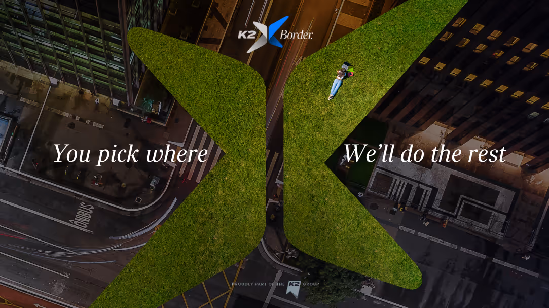
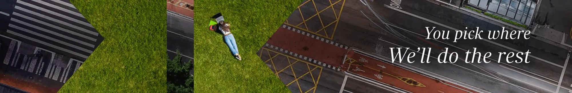
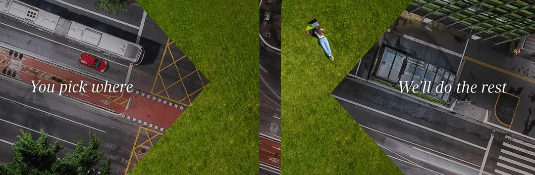
The Aerial Collection.
Our aerial imagery captures movement, scale and geography from a unique perspective. It reflects the global nature of our work and the journeys we support every day. These images give a sense of place and progression, offering a calm, elevated view that speaks to clarity, planning and control.

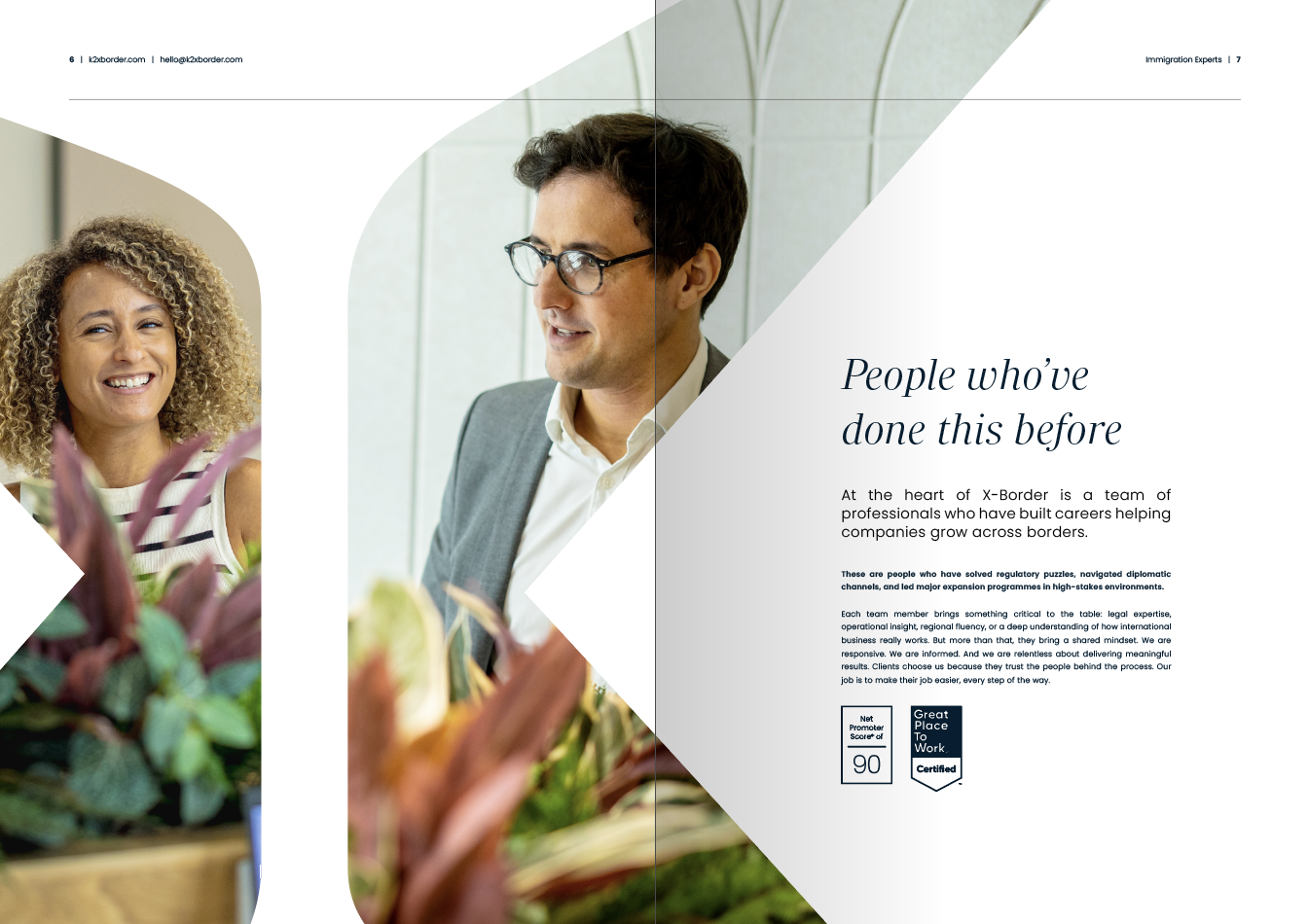
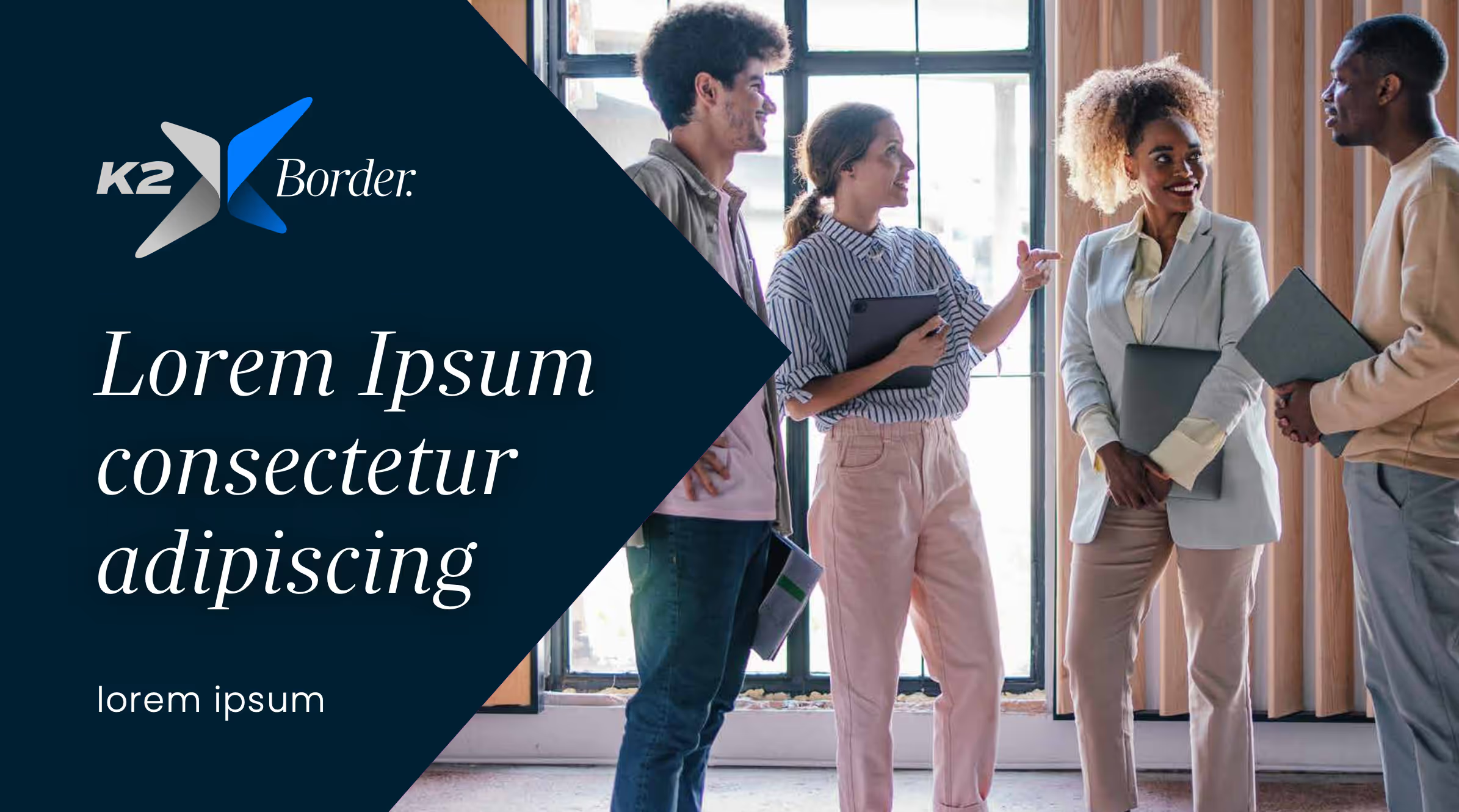
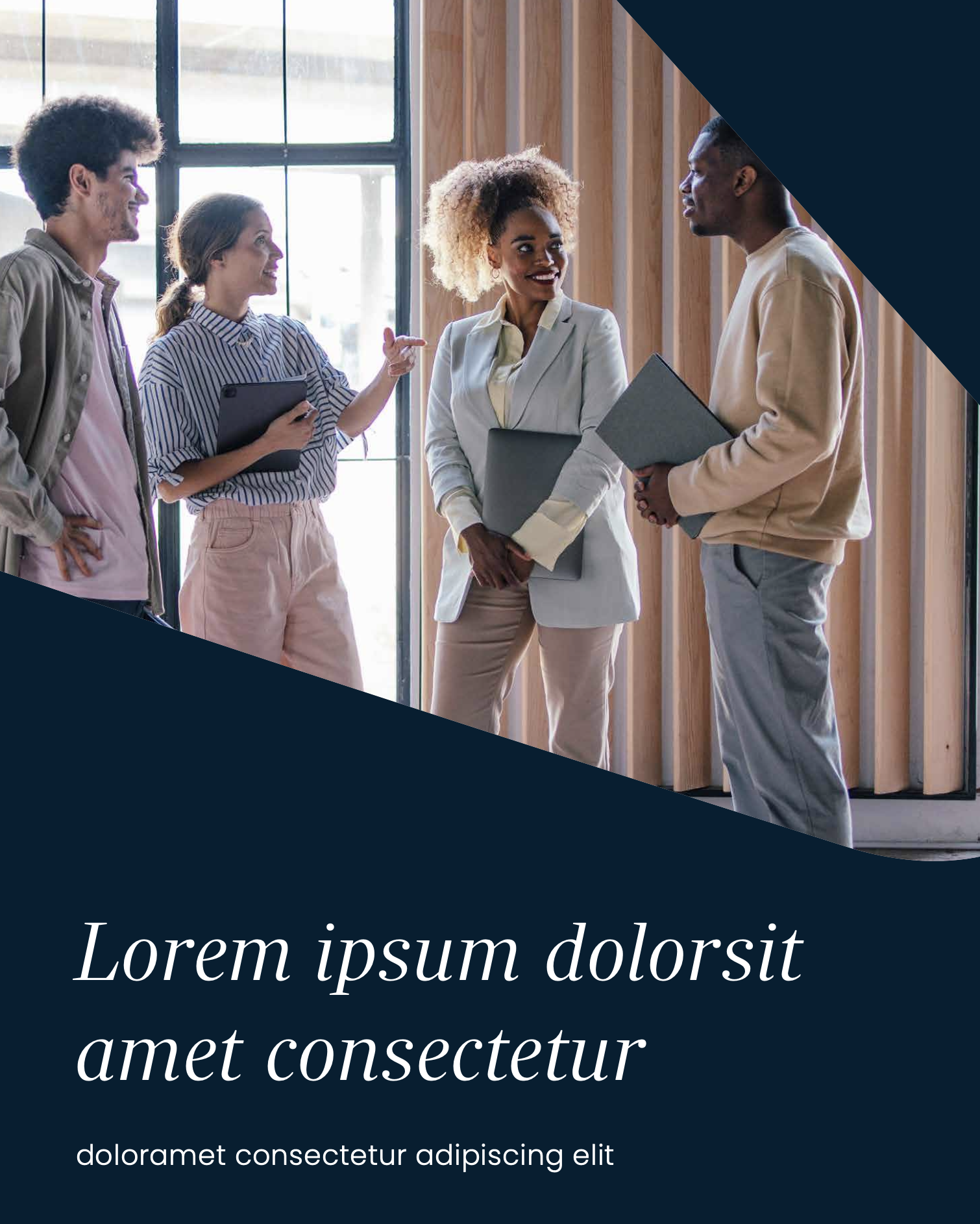
Human Moments.
Alongside our aerial imagery, we feature authentic human moments — at work, at home and in transition. These images reflect the real lives behind every immigration journey, grounding our visual identity in empathy and connection. Each shot is carefully selected to feel natural, respectful and quietly confident.
1.6 Image hierarchy
Our imagery is not decorative. It is part of how we guide our audience through a clear and purposeful visual journey.
We follow a two-stage hierarchy. First, aerial imagery sets the scene — conveying movement, perspective and global scale. Then, human moments bring the story closer, reflecting the personal experiences behind every immigration journey. Together, these stages mirror how our clients engage with us: with clarity first, then connection.

1.Aerial as scene setter. Aerial imagery introduces our visual world. It provides context, scale and direction. These images suggest movement, geography and possibility — all central themes in global immigration. They are calm, spacious and composed, helping the viewer feel grounded before detail is introduced.
This first layer sets the tone. It offers a wider perspective, aligning with the clarity and structure we bring to complex processes.

2.Human as personality. Once the scene is set, we move closer. Human imagery adds warmth, emotion and relevance. These moments represent the people behind every immigration journey — individuals, families and teams adapting to new places and new beginnings.
This layer brings personality and connection. It reminds the viewer that immigration is not just about process, it is about people — and that our work is personal at every stage.
1.7 Patterns
We do not use traditional patterns as part of the K2 X Border identity.
Instead, we create form and contrast by using the “X” from our logo as a framing device. This allows us to crop one aerial image onto another or introduce unexpected angles within standard imagery.
These shapes are subtle but intentional. They create focus, add curiosity, and reflect the intersection of places, people and processes that define our work. This approach keeps our visual language clean and considered, while adding depth to layouts and storytelling.

2.0 Brand voice
How we write is as important as how we look. Our voice reflects who we are — clear, considered and people-focused, just like our service.
Every word contributes to the K2 X Border experience. It ensures our communication feels informed, reassuring and aligned with the needs of our clients and their people. This section outlines how we write and speak across all channels, with guidance on our writing goals, principles, and the moments where clarity matters most.
At K2 X Border, every message should feel as dependable as our delivery — precise, supportive and always grounded in trust.

2.1 Writing goals & principles
Our writing reflects the same care, accuracy and understanding we bring to our immigration services. It is not just what we say, but how we say it that builds trust, supports clients and reinforces our professional standards.
Our core writing goals:
- To guide with confidence. Every message should reassure our audience that they are in safe, experienced hands.
- To connect with people. We write for individuals, not systems. Whether we are speaking to a client, an assignee or their family, we keep it human.
- To reflect our standards. Our words should carry the same precision, care and attention to detail as the service we deliver.
Our writing principles:
- Be clear. Use plain, structured language that is easy to understand, especially for a global audience.
- Demonstrate quality. We do not just say we are experts. We show it through real examples, not empty claims.
- Be purposeful. Every message should exist for a reason. If it does not help the reader, it does not need to be there.
- Keep it human. Even in complex or technical contexts, we speak with compassion, clarity and care.
- Adjust the tone, not the voice. We flex our tone to suit the channel or moment, but we always sound like ourselves: professional, thoughtful and focused.
2.2 Our voice
Our voice reflects who we are — expert, calm and people-focused. We speak with clarity and confidence, always balanced with warmth and care, because every message is part of a relationship, not just a process.
When writing as K2 X Border, ask yourself:
Would I say this directly to a client, an assignee or their family? Would it feel respectful, supportive and easy to understand? If not, rewrite it.
Our voice is:
- Human and empathetic. Immigration is often complex and personal. Our words should reflect the care and consideration we show in every case.
- Clear and confident. We guide with authority, without using jargon or overwhelming detail. Our confidence comes from experience, not volume.
- Reassuring and solutions-led. We focus on what is possible and how we can help. If challenges arise, we deal with them calmly and constructively.
- Professional but never distant. Our tone is polished, but not cold. We remain approachable, grounded and considered in everything we write.
- Thoughtful and composed. We write with intention, not flair for the sake of it. Our messages reflect the careful, tailored service we provide.
At every touchpoint, our voice should remind people why they trust K2 X Border — because we care deeply about getting it right, and we always put people first.
2.3 Our tone
Our tone changes depending on the situation, the audience and the message. While our voice stays consistent — human, clear and confident — our tone flexes to meet people where they are, and to reflect what they need from us.
Before writing, we ask:
- What is the purpose of this message? Are we informing, supporting, updating or guiding?
- Who are we speaking to? A client, an assignee, or a partner?
- Where are they in their journey? Are they just getting started, mid-process, or facing a challenge?
- Why should they read this? Is the content essential, reassuring or relationship-building?
- How will they receive it? A report, an email, a call or a presentation? Each format requires a tailored tone.
Adapting our tone
Introducing K2 X Border (Awareness & First Contact)
Our tone is composed, inviting and expert. We speak with clarity and confidence, showing the value of our focused service. We use language that reflects reassurance, reliability and readiness.
Supporting Clients and Assignees (Guidance & Ongoing Communication)
Here, our tone becomes calm, direct and helpful. We are clear in our guidance, supportive in our delivery, and always human in how we respond. We explain complexity without adding to it.
Navigating Sensitive Issues (Delays, Risk or Policy Change)
Our tone is empathetic and measured. We are transparent about the facts and thoughtful in how we share them. We prioritise clarity, respect and support, ensuring people feel informed and heard.
At every stage, our tone should reflect the same care we bring to our service. It should feel appropriate, considered and aligned with the trust people place in us. We do not overpromise. We communicate clearly and deliver with purpose.
2.4 Writing about K2 X Border
How we write about ourselves should always reflect our people-first mindset, specialist expertise and global awareness. Whether it’s a presentation, press release, social post or client email, we balance professional confidence with humility. The result should feel approachable, assured and sincere.
Referring to ourselves
We usually refer to ourselves as “we” rather than “K2 X Border”. It feels more human, natural and direct.
In formal contexts, such as press materials or award entries, it is appropriate to open with “K2 X Border” for clarity. After that, using “we” helps keep the tone warm and accessible.
Talking about our people
Our people are not just employees. They are specialists who bring clarity and calm to a complex field. We write about them with respect and pride, acknowledging their experience and dedication.
When highlighting teams, we focus on their collaboration and shared purpose rather than job titles or hierarchy. Our strength lies in how we work together.
Signing off
For internal communication, tone and sign-off can be more informal, depending on the relationship and setting.
Our global perspective
We are a global business with a people-first approach. We avoid regional references or cultural assumptions. Our language should always be inclusive and welcoming, no matter where the reader is based.
Style and personality
We are confident without being boastful, and warm without being overly casual. We welcome a touch of thoughtful wit on social media or in lighter moments, but it must always align with our brand values: clarity, care and professionalism.
If humour is used, it should be kind, respectful and never at anyone’s expense. We aim to communicate with the same integrity we bring to every immigration case.
2.5 Grammar, conventions & rules to break
We write the way people speak — clearly, naturally and with rhythm. It should feel like a conversation, not a script. Every message is written with care, but it should never feel forced or overly formal.
Our essentials
- We choose clarity over cleverness. No jargon. No unnecessary complexity.
- We use contractions. It’s “we’re” not “we are” and “you’ll” not “you will”.
- We write in sentence case, unless naming products, services or proper nouns.
- We use British English. That means “immigration programme” not “immigration program”, and “organisation” rather than “organization”. For US-specific audiences, we adapt.
Punctuation and flow
- Starting sentences with “And” or “But” is fine. It’s how people speak.
- We break up longer sentences to improve flow and understanding.
- We leave space. Especially in presentations and online, white space helps ideas land.
Writing for scanability
- Headings and subheadings help guide the reader. They should be useful, not vague.
- Bullet points are welcome. They make complex details easy to digest.
Rules we’re happy to break
- We split infinitives if it sounds better. “To clearly explain” beats “to explain clearly”.
- We start sentences with “Because” if it keeps the flow natural.
- We keep it short where it counts — in headlines, on social media, and anywhere readers move fast.
2.6 Our tone in short
We follow the rules of good writing, but we break them when it helps us sound more like K2 X Border.
- Clear but considered.
- Expert but approachable.
- Precise but never cold.
- Structured but natural.
- Professional but always human.
3.0 Brand activation
Our brand comes to life through the way people experience it — across touchpoints, channels and moments that matter. This section shows how our identity works in practice, bringing clarity, care and professionalism to every interaction.
These examples are more than inspiration. They are a guide to applying the K2 X Border brand in ways that are consistent, purposeful and unmistakably ours. This is how we show up in the world — considered, cohesive and always connected to the people we support.

3.1 Presentations, guides & templates
Consistency is key—every presentation, guide, and template should reflect the same precision, care, and excellence we bring to our real-world service. By dotting every i and crossing every t, we ensure our digital presence is as seamless, polished, and beyond exceptional as the experience we deliver.
PowerPoint
PowerPoint is one of our most visible tools. Whether used for internal updates, client meetings or training, it should reflect the same clarity and care we bring to our work.
Slides should be clean, structured and purposeful. Use space well, avoid clutter, and lead with strong headings. Aerial imagery works well for scene setting; human moments bring the story closer. Keep text minimal — say only what’s needed. The visuals, layout and language should guide the audience, not overwhelm them.
Word documents
Word documents are where detail lives — proposals, reports, policies and guides. They should be clear, consistent and easy to navigate.
Use our primary font for headings and body copy where possible, and follow brand spacing, tone and structure. Introduce each section with a short summary, and use subheadings and bullet points to break up information. Visuals should support, not distract. A well-written Word document reflects our professionalism, attention to detail and pride in doing things properly.
3.2 Profiles & brochures
Brochures
Our brochures are designed to reflect who we are and what we do — clearly, confidently and without unnecessary complexity. They bring our services, story and values together in a way that is easy to understand and visually consistent with our brand.
Each brochure follows a clean layout, with considered use of imagery, structured messaging and straightforward language. Whether printed or shared digitally, they should support conversations, not replace them — acting as a helpful introduction to what we offer and how we work.
Personalised Brochures
We tailor brochures for specific audiences when a more focused approach is needed. These versions adapt our messaging to suit the client’s context, sector or region, while staying true to our tone, voice and brand structure.
Personalised brochures are useful for new proposals, regional partnerships or sector-specific programmes. They help us show relevance, build trust and demonstrate that we understand what matters to the people we are speaking to. For support creating a tailored brochure, contact the brand team.
3.3 Stationery
Our stationery reflects clarity and professionalism. Designed for both digital and print use, it brings a clean, structured feel to every communication — whether it’s a printed letter or a shared PDF.
Letterheads and compliments slips
Templates are available in both A4 and legal formats, ready for formal correspondence across regions. Each one supports a consistent, considered experience.
Address labels & note cards
Address labels are produced in A5 sizing, notecards are produced in A5 sizing. Both carry our brand marks.
3.4 Socials
Our social media presence reflects the same clarity, care and expertise that define our work. Every post, comment and interaction is a chance to show who we are — informed, approachable and focused on supporting people through complex processes.
We use social channels to share insight, highlight our people and connect with audiences across regions. It is not about promotion, but communication — keeping our tone considered, respectful and always in line with the service we deliver.
All socials company profile image
The K2 X Border logo is shown as the icon only.

Personal profile photograph
Your LinkedIn profile photo should be professional, clear and approachable. Choose a high-quality, well-lit image that reflects the confident and considered nature of K2 X Border.
It should feel natural and personable — smart, not stiff — and present you as someone clients and colleagues can trust to guide them through complex journeys with care.

Business LinkedIn hero banner
A LinkedIn hero banner has been created using selected imagery from our visual collection. It reflects the K2 X Border identity and may be updated periodically to align with current campaigns or messaging.
Personal LinkedIn hero banner
A tailored LinkedIn banner is available for individual team members. It features understated imagery from our brand library, alongside the K2 X Border logo and our connection to K2 Group — offering a clear and professional presence.

Business X hero banner
A branded hero banner for X (formerly Twitter) is available using one of our approved image selections. Like our LinkedIn visuals, this may be refreshed over time to keep the brand presence current and aligned.
YouTube banners
YouTube banners have been created for use across playlists, channels and individual films where needed. A range of options is available to suit different formats and content types, ensuring consistency and flexibility across every use.
Timeline posts
A complete set of timeline post templates is available for use across all social platforms. These templates ensure visual consistency and brand alignment.
Always follow the approved copy guidance and use only the imagery provided. This keeps our messaging clear, confident and on-brand across every post.
3.5 Presenting oneself
Consistency across digital platforms helps reinforce the K2 X Border brand. A unified presence on Teams, email and social media supports a professional, well-aligned impression at every touchpoint.
Using matching Teams backgrounds, clear and consistent profile photos, and a polished digital setup all contribute to how we show up — composed, credible and ready to support with care.
Personal profile photograph
Your LinkedIn profile image should be clear, high quality and approachable — reflecting the professional and human nature of K2 X Border.
Teams backgrounds
Our Teams backgrounds are a key part of our visual presence — seen in every meeting, by every audience. Several designs are available, each featuring the K2 X Border logo, the K2 Group logo and a modest nod to our Great Place To Work accreditation and world-class NPS score.
Each background is carefully designed to frame you clearly on screen. When using one with lettering, check positioning to ensure the content remains visible and balanced.

Emails & signatures
Your email signature is generated automatically and includes your contact details along with links to our official social media channels. If it doesn’t display correctly, please contact the brand team.
When writing emails, use Arial at 11pt. This ensures a clean, consistent appearance that reflects the clarity and professionalism of K2 X Border communication.
4.0 Brand strategy
This is more than a brand — it’s a shared commitment to clarity, care and precision. Built on trust and guided by expertise, our strategy ensures every interaction feels thoughtful, seamless and dependable.
Immigration is personal. Whether we’re supporting a multinational workforce or an individual seeking the right to live and work abroad, our role is to make the process feel less complex and more human. Every detail matters — and every service we deliver is shaped with that in mind.
Our brand strategy is the foundation for how we communicate, operate and evolve. It brings consistency and credibility to everything we do, ensuring that K2 X Border is not only recognised — but remembered for the right reasons.

4.1 Our vision
We are driven by a clear focus: to provide a seamless, high-quality immigration service that puts people first. Every journey we support is handled with care, precision and a deep understanding of the challenges individuals and organisations face when crossing borders.
Our vision is simple — to make immigration feel personal, not procedural. We support globally mobile talent and their families with a service built around trust, empathy and expertise. Behind every move is a human story, and we aim to make that story smoother, safer and more certain.
What sets us apart is our integrity and attention to detail. We operate with transparency and structure, but never lose the flexibility to respond to real-life needs. Our work is underpinned by ISO 9001 and 27001 standards, reinforcing our commitment to consistent quality and continuous improvement. Every decision we make is centred on delivering an experience that builds confidence and strengthens relationships.
4.2 Our position
We don’t follow convention — we raise the standard. As specialists in global immigration, we are setting the pace, not chasing it. Others may disrupt; we deliver with precision and purpose, creating clarity where others create noise.
We don’t just meet expectations — we reshape them. Our approach is grounded in accuracy, adaptability and trust. Every decision, every service, and every conversation reflects our commitment to leading with integrity. We don’t wait for change; we help define it.
This is what it means to be K2 X Border.
4.3 Our purpose
Our purpose is simple: to deliver immigration services that are seamless, personal and built on trust. We support individuals and organisations with care, accuracy and a commitment to getting it right every time.
Every visa, permit or policy we manage is handled with focus and respect — because every case is about people. We do more than process paperwork. We bring clarity to complexity, and confidence to every journey. At K2 X Border, excellence is not a goal — it’s how we work.
4.4 Brand architecture
We are a brand built on precision, progress and a commitment to service that never loses its human touch. Our focus is immigration, and we lead with clarity, care and a determination to set the standard — not follow it.
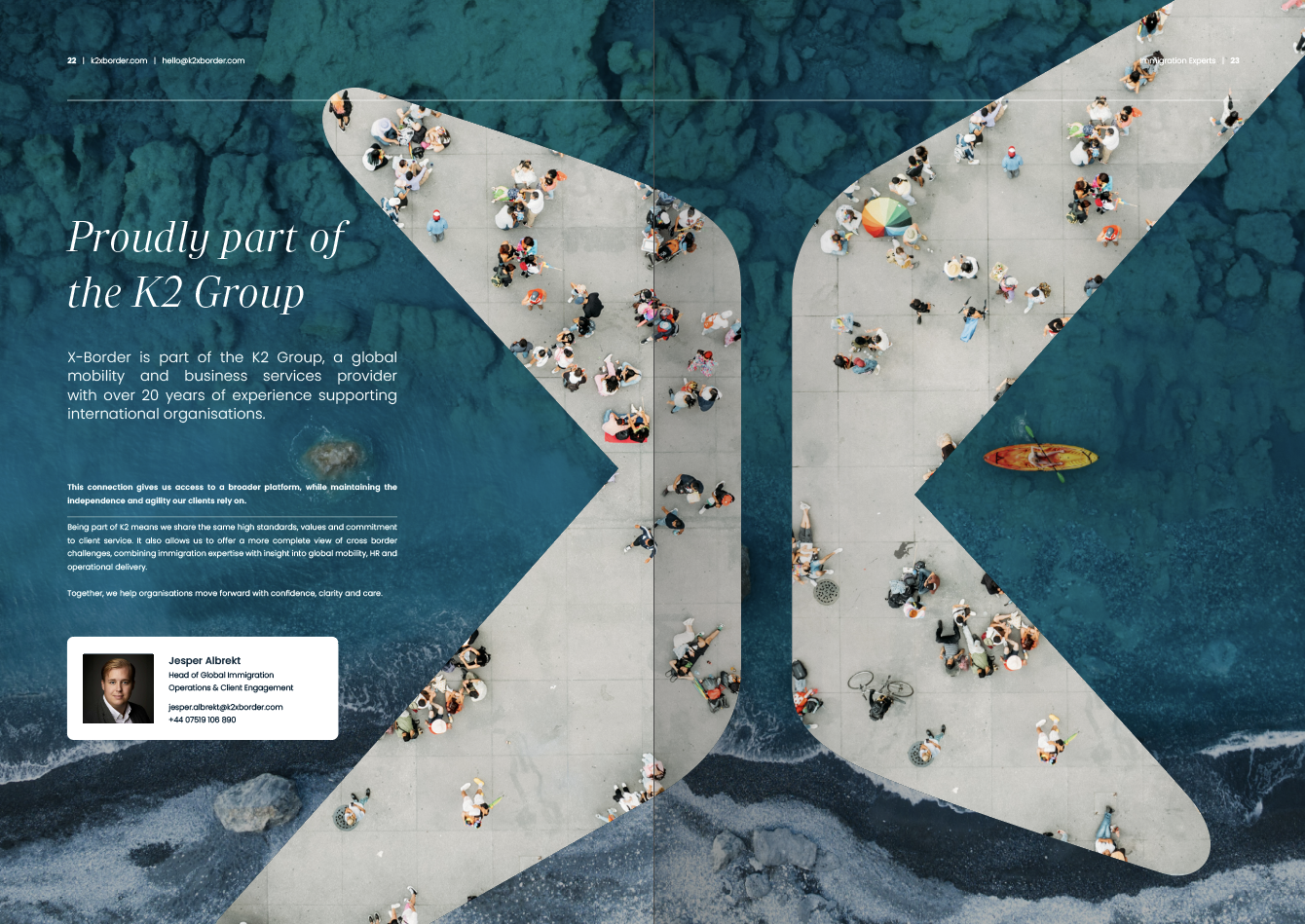
While we operate with a clear identity, we are proudly part of the K2 Group — a collective of specialist businesses that together support the full mobility journey. This connection gives us global strength, shared values and the depth to deliver seamless solutions at every stage.

4.5 Because it's personal
It’s not just a phrase — it’s the principle behind everything we do. From the first conversation to the final outcome, we treat every immigration journey with the attention and care it deserves. This isn’t about ticking boxes. It’s about understanding people, earning trust and delivering with purpose.
At K2 X Border, personal means thoughtful guidance, tailored solutions and clear communication at every step. We take pride in the detail, because it matters. And while this mindset defines our team, it’s also shared across the entire K2 Group. Together, we create connected, human-led experiences that stand apart — not just because they work, but because they feel right. That’s how it should be.
